
cycles logo dark
brand — Use the appropriate contrast variant and meaningful alt text when the logo conveys identity.
apiops-design-system/assets/brand/apiops-cycles-logo-dark.svg/design-system/brand/apiops-cycles-logo-dark.svgPackage reference
A living, English-only reference for the visual contracts shared by APIOps applications.
apiops-design-system owns visual tokens, assets, styles, and method-agnostic components. The canvas application and design-system mapping assigns grid, notes, metadata controls, modes, focus treatments, and print presentation to the package, while the consuming application owns state and domain decisions.
Method catalogs, station IDs, route data, localized method content, and persistence do not belong in this package. Applications supply those concerns to reusable visual primitives.
This inventory is rendered directly from apiops-design-system/tokens.json; values are not copied into this page. Token names are shown in their CSS custom property form for direct use with var(--token-name); the smaller label preserves the matching DTCG source path. The contract can cover color, typography, spacing, radius, shadow, focus, control, canvas, metro groups as they are published. This release declares color, canvas, font tokens.
| CSS token | Declared value | Usage guidance | Visual sample |
|---|---|---|---|
--color-neutral-graphiteSource: color.neutral.graphite | #0f172a | Use semantic colors for text, surfaces, routes, cycles, and note intent; never rely on color alone. | Color sample |
--color-neutral-slateSource: color.neutral.slate | #1e293b | Use semantic colors for text, surfaces, routes, cycles, and note intent; never rely on color alone. | Color sample |
--color-neutral-stoneSource: color.neutral.stone | #334155 | Use semantic colors for text, surfaces, routes, cycles, and note intent; never rely on color alone. | Color sample |
--color-neutral-cloudSource: color.neutral.cloud | #f5f7fa | Use semantic colors for text, surfaces, routes, cycles, and note intent; never rely on color alone. | Color sample |
--color-neutral-paperSource: color.neutral.paper | #ffffff | Use semantic colors for text, surfaces, routes, cycles, and note intent; never rely on color alone. | Color sample |
--color-line-businessSource: color.line.business | #10b981 | Use semantic colors for text, surfaces, routes, cycles, and note intent; never rely on color alone. | Color sample |
--color-line-architectureSource: color.line.architecture | #8b5cf6 | Use semantic colors for text, surfaces, routes, cycles, and note intent; never rely on color alone. | Color sample |
--color-line-deliverySource: color.line.delivery | #f5b30b | Use semantic colors for text, surfaces, routes, cycles, and note intent; never rely on color alone. | Color sample |
--color-line-publishingSource: color.line.publishing | #00a6a6 | Use semantic colors for text, surfaces, routes, cycles, and note intent; never rely on color alone. | Color sample |
--color-line-operating-modelSource: color.line.operatingModel | #1d4ed8 | Use semantic colors for text, surfaces, routes, cycles, and note intent; never rely on color alone. | Color sample |
--color-line-designSource: color.line.design | #ef4444 | Use semantic colors for text, surfaces, routes, cycles, and note intent; never rely on color alone. | Color sample |
--color-cycle-capabilitySource: color.cycle.capability | #02a972 | Use semantic colors for text, surfaces, routes, cycles, and note intent; never rely on color alone. | Color sample |
--color-cycle-apiSource: color.cycle.api | #5b5bd6 | Use semantic colors for text, surfaces, routes, cycles, and note intent; never rely on color alone. | Color sample |
--color-cycle-integrationSource: color.cycle.integration | #8b5cf6 | Use semantic colors for text, surfaces, routes, cycles, and note intent; never rely on color alone. | Color sample |
--color-cycle-automationSource: color.cycle.automation | #0a8f98 | Use semantic colors for text, surfaces, routes, cycles, and note intent; never rely on color alone. | Color sample |
--color-accent-communitySource: color.accent.community | #1656b8 | Use semantic colors for text, surfaces, routes, cycles, and note intent; never rely on color alone. | Color sample |
--color-note-draftSource: color.note.draft | #fff6bf | Use semantic colors for text, surfaces, routes, cycles, and note intent; never rely on color alone. | Color sample |
--color-note-committedSource: color.note.committed | #f7e9ff | Use semantic colors for text, surfaces, routes, cycles, and note intent; never rely on color alone. | Color sample |
--color-note-selectedSource: color.note.selected | #e0f4ff | Use semantic colors for text, surfaces, routes, cycles, and note intent; never rely on color alone. | Color sample |
--color-note-groupedSource: color.note.grouped | #ebf8d7 | Use semantic colors for text, surfaces, routes, cycles, and note intent; never rely on color alone. | Color sample |
--color-note-linkedSource: color.note.linked | #fef0d8 | Use semantic colors for text, surfaces, routes, cycles, and note intent; never rely on color alone. | Color sample |
--color-note-resolvedSource: color.note.resolved | #e9f8ef | Use semantic colors for text, surfaces, routes, cycles, and note intent; never rely on color alone. | Color sample |
--color-note-archivedSource: color.note.archived | #eef2f7 | Use semantic colors for text, surfaces, routes, cycles, and note intent; never rely on color alone. | Color sample |
--canvas-outer-marginSource: canvas.outerMargin | 32px | Use canvas dimensions through package styles when composing the exported canvas primitives. | Dimension sample |
--canvas-gutterSource: canvas.gutter | 16px | Use canvas dimensions through package styles when composing the exported canvas primitives. | Dimension sample |
--canvas-section-gapSource: canvas.sectionGap | 8px | Use canvas dimensions through package styles when composing the exported canvas primitives. | Dimension sample |
--canvas-section-paddingSource: canvas.sectionPadding | 20px | Use canvas dimensions through package styles when composing the exported canvas primitives. | Dimension sample |
--font-displaySource: font.display | Urbanist, Inter, Segoe UI, Arial, sans-serif | Use display for headings, body for reading, and code for paths or technical examples. | Aa |
--font-bodySource: font.body | Inter, Urbanist, Segoe UI, Arial, sans-serif | Use display for headings, body for reading, and code for paths or technical examples. | Aa |
--font-codeSource: font.code | JetBrains Mono, SFMono-Regular, Consolas, monospace | Use display for headings, body for reading, and code for paths or technical examples. | Aa |
The package asset metadata manifest is the source of this inventory. Download a standalone SVG, copy the supported package import, or use the public path example.
brand — Use the appropriate contrast variant and meaningful alt text when the logo conveys identity.
apiops-design-system/assets/brand/apiops-cycles-logo-dark.svg/design-system/brand/apiops-cycles-logo-dark.svg
brand — Use the appropriate contrast variant and meaningful alt text when the logo conveys identity.
apiops-design-system/assets/brand/apiops-cycles-logo-white.svg/design-system/brand/apiops-cycles-logo-white.svg
brand — Use the appropriate contrast variant and meaningful alt text when the logo conveys identity.
apiops-design-system/assets/brand/apiops-cycles-logo.svg/design-system/brand/apiops-cycles-logo.svg
favicon — Reference from document metadata; its neighboring page title supplies the accessible name.
apiops-design-system/assets/favicons/favicon.svg/design-system/favicons/favicon.svg
glyph — Treat decorative glyphs as hidden; label an action when a glyph is its only visible content.
apiops-design-system/assets/glyphs/apiops-check-mark.svg/design-system/glyphs/apiops-check-mark.svg
glyph — Treat decorative glyphs as hidden; label an action when a glyph is its only visible content.
apiops-design-system/assets/glyphs/apiops-flow-en-text.svg/design-system/glyphs/apiops-flow-en-text.svg
glyph — Treat decorative glyphs as hidden; label an action when a glyph is its only visible content.
apiops-design-system/assets/glyphs/apiops-flow.svg/design-system/glyphs/apiops-flow.svg
glyph — Treat decorative glyphs as hidden; label an action when a glyph is its only visible content.
apiops-design-system/assets/glyphs/apiops-iconset.svg/design-system/glyphs/apiops-iconset.svg
glyph — Treat decorative glyphs as hidden; label an action when a glyph is its only visible content.
apiops-design-system/assets/glyphs/apiops-metro-icons.svg/design-system/glyphs/apiops-metro-icons.svg
glyph — Treat decorative glyphs as hidden; label an action when a glyph is its only visible content.
apiops-design-system/assets/glyphs/apiops-station-circle-blue.svg/design-system/glyphs/apiops-station-circle-blue.svg
glyph — Treat decorative glyphs as hidden; label an action when a glyph is its only visible content.
apiops-design-system/assets/glyphs/apiops-station-circle.svg/design-system/glyphs/apiops-station-circle.svg
brand — Use the appropriate contrast variant and meaningful alt text when the logo conveys identity.
apiops-design-system/assets/brand/apiops-logo.svg/design-system/brand/apiops-logo.svg
brand — Use the appropriate contrast variant and meaningful alt text when the logo conveys identity.
apiops-design-system/assets/brand/apiops-mark-white.svg/design-system/brand/apiops-mark-white.svg
brand — Use the appropriate contrast variant and meaningful alt text when the logo conveys identity.
apiops-design-system/assets/brand/apiops-mark.svg/design-system/brand/apiops-mark.svgUse these scarf poses as the current human standard. The legacy stick-figure pose and story sheets are intentionally not shown here.

human
apiops-design-system/assets/humans/pose-with-scarf-amazed.svg/design-system/humans/pose-with-scarf-amazed.svg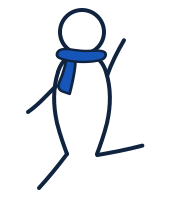
human
apiops-design-system/assets/humans/pose-with-scarf-dancing.svg/design-system/humans/pose-with-scarf-dancing.svg
human
apiops-design-system/assets/humans/pose-with-scarf-holding.svg/design-system/humans/pose-with-scarf-holding.svg
human
apiops-design-system/assets/humans/pose-with-scarf-holding-up.svg/design-system/humans/pose-with-scarf-holding-up.svg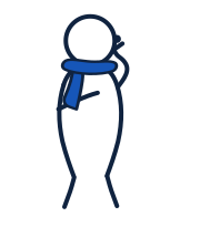
human
apiops-design-system/assets/humans/pose-with-scarf-listening.svg/design-system/humans/pose-with-scarf-listening.svg
human
apiops-design-system/assets/humans/pose-with-scarf-pointing.svg/design-system/humans/pose-with-scarf-pointing.svg
human
apiops-design-system/assets/humans/pose-with-scarf-standing.svg/design-system/humans/pose-with-scarf-standing.svg
human
apiops-design-system/assets/humans/pose-with-scarf-thinking.svg/design-system/humans/pose-with-scarf-thinking.svg
human
apiops-design-system/assets/humans/pose-with-scarf-walking.svg/design-system/humans/pose-with-scarf-walking.svg
human
apiops-design-system/assets/humans/pose-with-scarf-watching-hand-down.svg/design-system/humans/pose-with-scarf-watching-hand-down.svg
human
apiops-design-system/assets/humans/pose-with-scarf-watching-hand-up.svg/design-system/humans/pose-with-scarf-watching-hand-up.svgSVG sheets contain individually addressable symbols. Download a symbol as its own SVG, or reference it through an accessible inline SVG: give the SVG a name when it conveys meaning, or add aria-hidden="true" when decorative.
Concept icons for labelled supporting content.
/design-system/icons/apiops-iconset.svg#icon-insight<svg viewBox="0 0 120 120" role="img" aria-label="…"><use href="/design-system/icons/apiops-iconset.svg#icon-insight" /></svg>/design-system/icons/apiops-iconset.svg#icon-decision<svg viewBox="0 0 120 120" role="img" aria-label="…"><use href="/design-system/icons/apiops-iconset.svg#icon-decision" /></svg>/design-system/icons/apiops-iconset.svg#icon-conversation<svg viewBox="0 0 140 120" role="img" aria-label="…"><use href="/design-system/icons/apiops-iconset.svg#icon-conversation" /></svg>/design-system/icons/apiops-iconset.svg#icon-opportunity<svg viewBox="0 0 130 120" role="img" aria-label="…"><use href="/design-system/icons/apiops-iconset.svg#icon-opportunity" /></svg>/design-system/icons/apiops-iconset.svg#icon-capability<svg viewBox="0 0 140 120" role="img" aria-label="…"><use href="/design-system/icons/apiops-iconset.svg#icon-capability" /></svg>/design-system/icons/apiops-iconset.svg#icon-value<svg viewBox="0 0 130 120" role="img" aria-label="…"><use href="/design-system/icons/apiops-iconset.svg#icon-value" /></svg>/design-system/icons/apiops-iconset.svg#icon-people<svg viewBox="0 0 150 120" role="img" aria-label="…"><use href="/design-system/icons/apiops-iconset.svg#icon-people" /></svg>/design-system/icons/apiops-iconset.svg#icon-alignment<svg viewBox="0 0 150 120" role="img" aria-label="…"><use href="/design-system/icons/apiops-iconset.svg#icon-alignment" /></svg>/design-system/icons/apiops-iconset.svg#icon-risk<svg viewBox="0 0 150 120" role="img" aria-label="…"><use href="/design-system/icons/apiops-iconset.svg#icon-risk" /></svg>/design-system/icons/apiops-iconset.svg#icon-quality<svg viewBox="0 0 150 120" role="img" aria-label="…"><use href="/design-system/icons/apiops-iconset.svg#icon-quality" /></svg>/design-system/icons/apiops-iconset.svg#icon-flow<svg viewBox="0 0 150 120" role="img" aria-label="…"><use href="/design-system/icons/apiops-iconset.svg#icon-flow" /></svg>/design-system/icons/apiops-iconset.svg#icon-learn<svg viewBox="0 0 140 120" role="img" aria-label="…"><use href="/design-system/icons/apiops-iconset.svg#icon-learn" /></svg>Journey, station, actor, and event symbols for diagrams.
/design-system/icons/apiops-metro-icons.svg#glyph-station<svg viewBox="0 0 120 120" role="img" aria-label="…"><use href="/design-system/icons/apiops-metro-icons.svg#glyph-station" /></svg>/design-system/icons/apiops-metro-icons.svg#glyph-hub<svg viewBox="0 0 120 120" role="img" aria-label="…"><use href="/design-system/icons/apiops-metro-icons.svg#glyph-hub" /></svg>/design-system/icons/apiops-metro-icons.svg#glyph-interchange<svg viewBox="0 0 120 120" role="img" aria-label="…"><use href="/design-system/icons/apiops-metro-icons.svg#glyph-interchange" /></svg>/design-system/icons/apiops-metro-icons.svg#glyph-route-split<svg viewBox="0 0 130 120" role="img" aria-label="…"><use href="/design-system/icons/apiops-metro-icons.svg#glyph-route-split" /></svg>/design-system/icons/apiops-metro-icons.svg#glyph-arrive<svg viewBox="0 0 150 120" role="img" aria-label="…"><use href="/design-system/icons/apiops-metro-icons.svg#glyph-arrive" /></svg>/design-system/icons/apiops-metro-icons.svg#glyph-join<svg viewBox="0 0 150 120" role="img" aria-label="…"><use href="/design-system/icons/apiops-metro-icons.svg#glyph-join" /></svg>/design-system/icons/apiops-metro-icons.svg#glyph-explore<svg viewBox="0 0 150 120" role="img" aria-label="…"><use href="/design-system/icons/apiops-metro-icons.svg#glyph-explore" /></svg>/design-system/icons/apiops-metro-icons.svg#glyph-decide<svg viewBox="0 0 150 120" role="img" aria-label="…"><use href="/design-system/icons/apiops-metro-icons.svg#glyph-decide" /></svg>/design-system/icons/apiops-metro-icons.svg#glyph-continue<svg viewBox="0 0 150 120" role="img" aria-label="…"><use href="/design-system/icons/apiops-metro-icons.svg#glyph-continue" /></svg>/design-system/icons/apiops-metro-icons.svg#glyph-learn<svg viewBox="0 0 150 120" role="img" aria-label="…"><use href="/design-system/icons/apiops-metro-icons.svg#glyph-learn" /></svg>/design-system/icons/apiops-metro-icons.svg#glyph-iterate<svg viewBox="0 0 150 120" role="img" aria-label="…"><use href="/design-system/icons/apiops-metro-icons.svg#glyph-iterate" /></svg>/design-system/icons/apiops-metro-icons.svg#glyph-publish<svg viewBox="0 0 150 120" role="img" aria-label="…"><use href="/design-system/icons/apiops-metro-icons.svg#glyph-publish" /></svg>/design-system/icons/apiops-metro-icons.svg#glyph-measure<svg viewBox="0 0 150 120" role="img" aria-label="…"><use href="/design-system/icons/apiops-metro-icons.svg#glyph-measure" /></svg>/design-system/icons/apiops-metro-icons.svg#glyph-shared-momentum<svg viewBox="0 0 180 120" role="img" aria-label="…"><use href="/design-system/icons/apiops-metro-icons.svg#glyph-shared-momentum" /></svg>/design-system/icons/apiops-metro-icons.svg#glyph-passengers<svg viewBox="0 0 200 130" role="img" aria-label="…"><use href="/design-system/icons/apiops-metro-icons.svg#glyph-passengers" /></svg>/design-system/icons/apiops-metro-icons.svg#glyph-waiting<svg viewBox="0 0 180 150" role="img" aria-label="…"><use href="/design-system/icons/apiops-metro-icons.svg#glyph-waiting" /></svg>/design-system/icons/apiops-metro-icons.svg#glyph-workshop<svg viewBox="0 0 220 150" role="img" aria-label="…"><use href="/design-system/icons/apiops-metro-icons.svg#glyph-workshop" /></svg>/design-system/icons/apiops-metro-icons.svg#glyph-meetup<svg viewBox="0 0 240 160" role="img" aria-label="…"><use href="/design-system/icons/apiops-metro-icons.svg#glyph-meetup" /></svg>/design-system/icons/apiops-metro-icons.svg#glyph-conference<svg viewBox="0 0 240 170" role="img" aria-label="…"><use href="/design-system/icons/apiops-metro-icons.svg#glyph-conference" /></svg>/design-system/icons/apiops-metro-icons.svg#glyph-speaker<svg viewBox="0 0 220 170" role="img" aria-label="…"><use href="/design-system/icons/apiops-metro-icons.svg#glyph-speaker" /></svg>APIOps Character Grammar nouns and connection marks for composing scenes.
/design-system/icons/apiops-character-notation.svg#symbol-api<svg viewBox="0 0 120 120" role="img" aria-label="…"><use href="/design-system/icons/apiops-character-notation.svg#symbol-api" /></svg>/design-system/icons/apiops-character-notation.svg#symbol-api-card<svg viewBox="0 0 150 100" role="img" aria-label="…"><use href="/design-system/icons/apiops-character-notation.svg#symbol-api-card" /></svg>/design-system/icons/apiops-character-notation.svg#symbol-contract<svg viewBox="0 0 120 120" role="img" aria-label="…"><use href="/design-system/icons/apiops-character-notation.svg#symbol-contract" /></svg>/design-system/icons/apiops-character-notation.svg#symbol-code-brackets<svg viewBox="0 0 120 120" role="img" aria-label="…"><use href="/design-system/icons/apiops-character-notation.svg#symbol-code-brackets" /></svg>/design-system/icons/apiops-character-notation.svg#symbol-curly-contract<svg viewBox="0 0 120 120" role="img" aria-label="…"><use href="/design-system/icons/apiops-character-notation.svg#symbol-curly-contract" /></svg>/design-system/icons/apiops-character-notation.svg#symbol-field<svg viewBox="0 0 120 120" role="img" aria-label="…"><use href="/design-system/icons/apiops-character-notation.svg#symbol-field" /></svg>/design-system/icons/apiops-character-notation.svg#symbol-question<svg viewBox="0 0 80 120" role="img" aria-label="…"><use href="/design-system/icons/apiops-character-notation.svg#symbol-question" /></svg>/design-system/icons/apiops-character-notation.svg#symbol-alert<svg viewBox="0 0 80 120" role="img" aria-label="…"><use href="/design-system/icons/apiops-character-notation.svg#symbol-alert" /></svg>/design-system/icons/apiops-character-notation.svg#symbol-board<svg viewBox="0 0 140 120" role="img" aria-label="…"><use href="/design-system/icons/apiops-character-notation.svg#symbol-board" /></svg>/design-system/icons/apiops-character-notation.svg#symbol-stop<svg viewBox="0 0 120 120" role="img" aria-label="…"><use href="/design-system/icons/apiops-character-notation.svg#symbol-stop" /></svg>/design-system/icons/apiops-character-notation.svg#symbol-rocket<svg viewBox="0 0 120 120" role="img" aria-label="…"><use href="/design-system/icons/apiops-character-notation.svg#symbol-rocket" /></svg>/design-system/icons/apiops-character-notation.svg#symbol-product-cube<svg viewBox="0 0 120 120" role="img" aria-label="…"><use href="/design-system/icons/apiops-character-notation.svg#symbol-product-cube" /></svg>/design-system/icons/apiops-character-notation.svg#symbol-capability-package<svg viewBox="0 0 140 120" role="img" aria-label="…"><use href="/design-system/icons/apiops-character-notation.svg#symbol-capability-package" /></svg>/design-system/icons/apiops-character-notation.svg#symbol-standard-placard<svg viewBox="0 0 160 120" role="img" aria-label="…"><use href="/design-system/icons/apiops-character-notation.svg#symbol-standard-placard" /></svg>/design-system/icons/apiops-character-notation.svg#symbol-standard-placard-blank<svg viewBox="0 0 160 120" role="img" aria-label="…"><use href="/design-system/icons/apiops-character-notation.svg#symbol-standard-placard-blank" /></svg>/design-system/icons/apiops-character-notation.svg#symbol-architecture-cube<svg viewBox="0 0 120 120" role="img" aria-label="…"><use href="/design-system/icons/apiops-character-notation.svg#symbol-architecture-cube" /></svg>/design-system/icons/apiops-character-notation.svg#symbol-code-design<svg viewBox="0 0 120 120" role="img" aria-label="…"><use href="/design-system/icons/apiops-character-notation.svg#symbol-code-design" /></svg>/design-system/icons/apiops-character-notation.svg#symbol-delivery-gear<svg viewBox="0 0 120 120" role="img" aria-label="…"><use href="/design-system/icons/apiops-character-notation.svg#symbol-delivery-gear" /></svg>/design-system/icons/apiops-character-notation.svg#symbol-feedback-megaphone<svg viewBox="0 0 140 120" role="img" aria-label="…"><use href="/design-system/icons/apiops-character-notation.svg#symbol-feedback-megaphone" /></svg>/design-system/icons/apiops-character-notation.svg#symbol-consumer-group<svg viewBox="0 0 150 120" role="img" aria-label="…"><use href="/design-system/icons/apiops-character-notation.svg#symbol-consumer-group" /></svg>/design-system/icons/apiops-character-notation.svg#symbol-local-api-block<svg viewBox="0 0 120 120" role="img" aria-label="…"><use href="/design-system/icons/apiops-character-notation.svg#symbol-local-api-block" /></svg>/design-system/icons/apiops-character-notation.svg#symbol-local-contract-block<svg viewBox="0 0 120 120" role="img" aria-label="…"><use href="/design-system/icons/apiops-character-notation.svg#symbol-local-contract-block" /></svg>/design-system/icons/apiops-character-notation.svg#symbol-local-system-block<svg viewBox="0 0 120 120" role="img" aria-label="…"><use href="/design-system/icons/apiops-character-notation.svg#symbol-local-system-block" /></svg>/design-system/icons/apiops-character-notation.svg#connection-chaos<svg viewBox="0 0 220 140" role="img" aria-label="…"><use href="/design-system/icons/apiops-character-notation.svg#connection-chaos" /></svg>/design-system/icons/apiops-character-notation.svg#connection-branching<svg viewBox="0 0 220 140" role="img" aria-label="…"><use href="/design-system/icons/apiops-character-notation.svg#connection-branching" /></svg>/design-system/icons/apiops-character-notation.svg#connection-ownership-claim<svg viewBox="0 0 220 140" role="img" aria-label="…"><use href="/design-system/icons/apiops-character-notation.svg#connection-ownership-claim" /></svg>/design-system/icons/apiops-character-notation.svg#connection-missing-conversation<svg viewBox="0 0 220 140" role="img" aria-label="…"><use href="/design-system/icons/apiops-character-notation.svg#connection-missing-conversation" /></svg>/design-system/icons/apiops-character-notation.svg#connection-gap<svg viewBox="0 0 220 140" role="img" aria-label="…"><use href="/design-system/icons/apiops-character-notation.svg#connection-gap" /></svg>/design-system/icons/apiops-character-notation.svg#connection-conversion-arrow<svg viewBox="0 0 220 80" role="img" aria-label="…"><use href="/design-system/icons/apiops-character-notation.svg#connection-conversion-arrow" /></svg>/design-system/icons/apiops-character-notation.svg#symbol-blocker<svg viewBox="0 0 120 120" role="img" aria-label="…"><use href="/design-system/icons/apiops-character-notation.svg#symbol-blocker" /></svg>/design-system/icons/apiops-character-notation.svg#symbol-standard<svg viewBox="0 0 160 120" role="img" aria-label="…"><use href="/design-system/icons/apiops-character-notation.svg#symbol-standard" /></svg>/design-system/icons/apiops-character-notation.svg#symbol-lifecycle<svg viewBox="0 0 140 120" role="img" aria-label="…"><use href="/design-system/icons/apiops-character-notation.svg#symbol-lifecycle" /></svg>/design-system/icons/apiops-character-notation.svg#symbol-publish<svg viewBox="0 0 120 120" role="img" aria-label="…"><use href="/design-system/icons/apiops-character-notation.svg#symbol-publish" /></svg>/design-system/icons/apiops-character-notation.svg#symbol-ownership-api<svg viewBox="0 0 140 120" role="img" aria-label="…"><use href="/design-system/icons/apiops-character-notation.svg#symbol-ownership-api" /></svg>/design-system/icons/apiops-character-notation.svg#symbol-megaphone<svg viewBox="0 0 140 120" role="img" aria-label="…"><use href="/design-system/icons/apiops-character-notation.svg#symbol-megaphone" /></svg>/design-system/icons/apiops-character-notation.svg#symbol-workshop-board<svg viewBox="0 0 140 120" role="img" aria-label="…"><use href="/design-system/icons/apiops-character-notation.svg#symbol-workshop-board" /></svg>/design-system/icons/apiops-character-notation.svg#symbol-check-bullet<svg viewBox="0 0 40 40" role="img" aria-label="…"><use href="/design-system/icons/apiops-character-notation.svg#symbol-check-bullet" /></svg>Generated APIOps Character Grammar scene recipes based on the scarf pose assets.
/design-system/humans/apiops-character-scenes.svg#scene-chaos-to-capabilities<svg viewBox="0 0 560 300" role="img" aria-label="…"><use href="/design-system/humans/apiops-character-scenes.svg#scene-chaos-to-capabilities" /></svg>/design-system/humans/apiops-character-scenes.svg#scene-shared-picture-missing<svg viewBox="0 0 420 220" role="img" aria-label="…"><use href="/design-system/humans/apiops-character-scenes.svg#scene-shared-picture-missing" /></svg>/design-system/humans/apiops-character-scenes.svg#scene-local-optimization<svg viewBox="0 0 420 220" role="img" aria-label="…"><use href="/design-system/humans/apiops-character-scenes.svg#scene-local-optimization" /></svg>/design-system/humans/apiops-character-scenes.svg#scene-consumers-capabilities<svg viewBox="0 0 420 240" role="img" aria-label="…"><use href="/design-system/humans/apiops-character-scenes.svg#scene-consumers-capabilities" /></svg>/design-system/humans/apiops-character-scenes.svg#scene-governance-vs-innovation<svg viewBox="0 0 420 220" role="img" aria-label="…"><use href="/design-system/humans/apiops-character-scenes.svg#scene-governance-vs-innovation" /></svg>/design-system/humans/apiops-character-scenes.svg#scene-api-first-not-enough<svg viewBox="0 0 420 220" role="img" aria-label="…"><use href="/design-system/humans/apiops-character-scenes.svg#scene-api-first-not-enough" /></svg>/design-system/humans/apiops-character-scenes.svg#scene-api-ownership-question<svg viewBox="0 0 420 240" role="img" aria-label="…"><use href="/design-system/humans/apiops-character-scenes.svg#scene-api-ownership-question" /></svg>/design-system/humans/apiops-character-scenes.svg#scene-standards-without-conversation<svg viewBox="0 0 420 240" role="img" aria-label="…"><use href="/design-system/humans/apiops-character-scenes.svg#scene-standards-without-conversation" /></svg>/design-system/humans/apiops-character-scenes.svg#scene-feedback-invitation<svg viewBox="0 0 420 240" role="img" aria-label="…"><use href="/design-system/humans/apiops-character-scenes.svg#scene-feedback-invitation" /></svg>/design-system/humans/apiops-character-scenes.svg#scene-workshop-invitation<svg viewBox="0 0 420 240" role="img" aria-label="…"><use href="/design-system/humans/apiops-character-scenes.svg#scene-workshop-invitation" /></svg>/design-system/humans/apiops-character-scenes.svg#scene-team-celebration<svg viewBox="0 0 420 180" role="img" aria-label="…"><use href="/design-system/humans/apiops-character-scenes.svg#scene-team-celebration" /></svg>These hydrated, method-neutral fixtures demonstrate CompactSection, interactive PillList buttons, ResourceSelector cards, PartnerCard with a logo, AnnouncementToast, StakeholderRoleSelector, buttons, and a drop-down menu.
Confirm the outcome, audience, and next decision.
Selected: clarity
Native controls inherit the package typography and focus treatment; component-specific buttons add selected, pressed, and disabled semantics.
The public React entry point also exposes the lower-level canvas and metro composition primitives:
CompactSectionPillListResourceSelectorJourneyCriteriaPartnerCardAnnouncementToastStakeholderRoleSelectorRoleParticipationTableMethodContextBarMethodContextEditorContextGuidanceMetroMapShellMetroLinePathMetroSelectionRingMetroStationButtonMetroStationMarkerMetroLegendCanvasSystemShellCanvasSystemGridCanvasSystemZoneCanvasSystemNoteViewCanvasSystemMetadataEditorCanvasSystemMetadataReadOnlyCanvasSystemFixtureThe persistent strip, progressive editor, and success, warning, and neutral guidance states use package tokens and existing icon sheets. Applications supply localized values and route-aware behavior.
RoleParticipationTable presents one role’s stations, involvement, and explicitly linked resources within a single cycle. Applications provide localized labels, links, and method data; the design system owns the semantic table, involvement icons, resource chips, and responsive presentation.
| Station | Involvement | Role resources |
|---|---|---|
| Product strategy | Lead | |
| Interface design | Core | |
| Readiness review | Consulted | No role-specific resources linked. |
This example composes MetroMapShell, MetroLinePath, MetroStationButton, MetroStationMarker, MetroSelectionRing, and MetroLegend without importing the generated method catalog. It includes keyboard operation and selected-state behavior; route and station data remain application-owned.
Tab to either station and press Enter or Space. The selected station receives a visible selection ring.
The hydrated CanvasSystemFixture documents interactive, presentation, and print modes together with active-section and focus-only behavior. Its metadata editor and read-only metadata, populated and empty note areas, anchor highlight, and journey treatment exercise the complete visual contract.
Canvas system fixture
Visual states are deliberately colocated for regression review.
An anchor section with a populated note area.
A journey treatment with an intentionally empty note area.
Canvas system fixture
Visual states are deliberately colocated for regression review.
An anchor section with a populated note area.
Populated note
A journey treatment with an intentionally empty note area.
Canvas system fixture
Visual states are deliberately colocated for regression review.
An anchor section with a populated note area.
Populated note
A journey treatment with an intentionally empty note area.
Import the application stylesheet once in the application layout, then import components and data only where needed.
import { CanvasSystemFixture } from "apiops-design-system";
import { MetroMapShell } from "apiops-design-system/react";
import "apiops-design-system/styles.css"; // once, in the application layout
import tokens from "apiops-design-system/tokens.json";
import { designSystemAssets } from "apiops-design-system/assets";
import assetManifest from "apiops-design-system/metadata/assets.json";
The supported public boundaries are apiops-design-system, /react, /styles.css, /tokens.json, /assets, and /metadata/*.